When we first looked at our current one bedroom co-op apartment, it was a cool, sterile silvery gray. The previous owner had made some nice upgrades to cabinets, appliances, and floors, but overall the effect was hotel-like and bland with no personality.
In order to make it a place that felt like home, I knew the simplest solution was color and that strategic paint was the quickest way to create a fitting backdrop for our stuff.
I selected all the paint from Sherwin-Williams because I liked the color palettes best after comparing to Behr and Benjamin Moore. Also there is a store location a couple blocks from the apartment.
Here are the colors I used, where I used them and why.
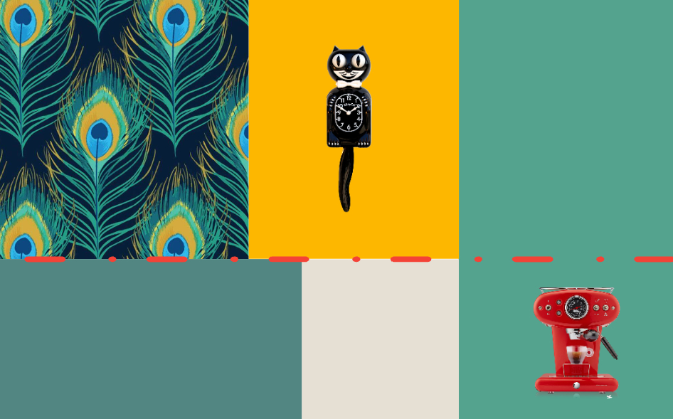
- Lagoon: This classy blue green from Sherwin-Williams makes the perfect accent wall in our living room. Not only does is complement our dining area’s Deco Peacock wallpaper from Fancy Walls, but it is the most soothing background for our television. My husband’s desk is also in the living area and Lagoon is a lovely wallcolor to frame him on his virtual meetings.
- Goldfinch: The kitchen’s modern cabinets are shiny charcoal gray with silver handles. With the original gray and white walls and stainless steel appliances, the kitchen had no sense of humor. In order to make our Fiestaware and red accents pop, we needed a bright, cheerful shade. This rich yellow on two walls of the small galley-style kitchen makes me smile. And, since we can get a peek of it through the pass through window from the living/dining area, it is a bonus that this golden hue also works with the Deco Peacock paper.
- Jargon Jade: In the bedroom, where my pink iMac dominates my desk area, a brighter green color adjacent to Lagoon is a good choice for the accent wall behind our super simple bed (white sheets, black metal headboard). The pop of green accentuates some artwork dominated by red and black and complements some other objects in the room that have bright pinks like a vintage flamingo vase.
- Extra White: All of the trim, doors and moulding are gloss Extra White and the ceilings are flat finish. This is a crisp and clean cool white that makes everything look sharp.
- Shoji White: This is the best greige shade, warmer than the original silvery gray tone on the walls, as well as a bit chameolon-like depending on the objects it is near.
All in all, I am extremely pleased with the choices that help make each space unique while still unifying the apartment as a whole. These are definitely fun colors with a mid-century modern nod. I could see Lagoon on the walls of Don Draper’s office.

Leave a comment